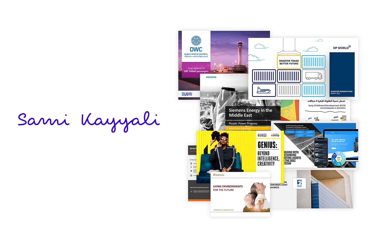
In the world of presentations, the transformation of raw data into a visually appealing and engaging experience is a true art. The ability to seamlessly combine data with design elements not only enhances the aesthetic appeal but also improves the comprehension and retention of information. “From Data to Design” encapsulates the process of turning complex data into a captivating visual narrative in your presentation deck design, creating a powerful impact on your audience.
1. Unleashing the Power of Visual Communication
Visual aesthetics play a pivotal role in conveying information effectively. Humans are naturally drawn to images and graphics, which can communicate complex concepts faster than text alone. Incorporating visually pleasing elements transforms your presentation from a mundane data dump into an engaging story.
2. Simplifying Complex Data
Numbers and statistics can be daunting to digest, but a well-designed presentation deck can simplify even the most intricate data sets. Infographics, charts, and graphs distill complex information into easy-to-understand visual representations, making the content more accessible to your audience.
3. Establishing Visual Consistency
Consistency in design elements is crucial to maintain a professional look throughout your presentation. Select a color palette, font styles, and layout templates that align with your brand or message. This visual consistency establishes credibility and helps your audience focus on the content.
4. Creating a Visual Hierarchy
Not all data points are equal in significance. Design your presentation deck with a clear visual hierarchy that emphasizes key points while providing supporting details. This hierarchy guides the viewer’s eye and ensures that the most important information is readily apparent.
5. Balancing Information Density
Effective presentation deck design strikes a balance between information density and visual clarity. Overloading slides with excessive data can overwhelm your audience, while overly simplistic slides may lack substance. The challenge lies in presenting the right amount of information in an engaging way.
6. Incorporating Engaging Visuals
Visual aesthetics go beyond graphs and charts. Utilize high-quality images, icons, and illustrations to add visual interest to your presentation. Well-chosen visuals can evoke emotions, reinforce your message, and create a memorable experience for your audience.
7. Storytelling through Data
The journey from data to design involves weaving a compelling narrative. Your data should tell a story that captivates your audience and leads them through a logical progression. Introduce the problem, present the data-driven insights, and conclude with actionable takeaways.
